9 min read

Published
August 14, 2025
How UXi Ensures Consistency in Design Systems

Tim
Head of UX/UI
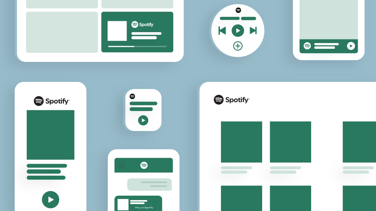
You’ve just bought a brand new, modern car that can do more than turn on the lights, and wow, when you connect your phone to it, you can play music directly from your Spotify! As you explore how it works, you realise it’s all very familiar – almost exactly like on your phone. As it turns out, Spotify feels exactly the same no matter where you use it.
And why is that? The answer is twofold: Spotify has an incredibly strong brand identity powered by a clearly well thought out design system. This is the key to building a strong user experience. Add our UXi method into the mix, and you’re on a good path of serving your customers exactly what they need, while ensuring it all looks just right.
And why does it all work together so well? Let’s get into it.
Design systems are the approach that ensures consistency across all touchpoints. Without a design system, you end up with different teams building the same components in different ways. One team makes a button with a 6-pixel corner radius, another uses 7. It may seem minor, but these inconsistencies affect how people perceive the brand.
Let’s go back to Spotify for a moment. Some years ago, their website, app, and integrations all looked and felt completely different. Then they built a strong design system aligned with their brand, and now everything is cohesive. Same goes for Airbnb – when you book something on the app or on the website, the animations and interactions are all the same and reflect their brand identity. A design system enables that kind of alignment across all platforms and teams. It defines things like colors, typography, spacing, and even motion design, ensuring consistency across all touch points.
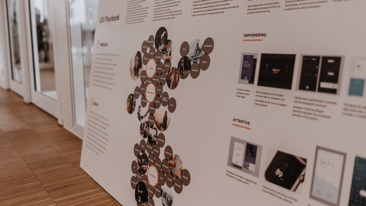
There are many benefits to using a design system, but one that’s particularly relevant to this article is consistency. You can look at consistency as the foundation that builds brand credibility. The starting point is figuring out what your brand stands for. Our UXi method is a great way in taking that first step.
Let’s take a look at what happens when you add design systems into the equation.
While there are white-label design systems out there – a kind of ready-made starter kits that you can customize – and while they're quite serviceable, they usually don’t get you to that deeply customized, brand-driven result. Sometimes, even strong brands haven’t fully translated their identity into digital. They define colors, maybe some additional UI elements, but don’t think deeply about how it’s perceived.
UXi bridges that gap – it’s there to make sure your product and its design language actually feel like the brand. In that sense, you can look at UXi as the conduit between branding and how a product looks digitally. It defines the colours and styles for digital products while ensuring they remain rooted in the brand’s identity.
Even with established brands, there’s often a gap between the branding and how it comes across digitally. By implementing design systems with the UXi method, we ensure that every brand expression aligns with the values the brand stands for. For example, the principle of “approachability” can mean different things, depending on the context.
Looking back at one of the projects I worked on, the client already had a defined brand and a design system, but visually, it felt somewhat… generic, uninspiring. Thousands of people use the client’s internal tools – but it wasn’t really feeling like the brand. So we needed to transport the brand values into the tool. When we came in, we applied our UXi method to really understand how the brand should feel in a professional context. We needed to make sure every designer knew what the brand stood for, and what every value – such as approachability – meant in the context of this brand.

When determining how a brand can be expressed through UX and UI, we usually run workshops with the client and then translate the outcome into a design system. For this specific client, once we had a solid foundation, a clear design vision, and alignment with all stakeholders, we developed a more refined, premium design language. The result was a design system that not only looked better but also gained internal traction. People actually wanted to use it – and that’s key. When it looks and feels right, people are far more likely to adopt it and use it.
Building and maintaining a design system may seem daunting, especially in the beginning. Oftentimes, that tends to be a bottleneck in projects. Without a design system in place, you might move faster in the short term, but then a rebranding comes, and you have to redo everything. If you’d invested early in a design system, updates would be much easier – and future teams could hit the ground running with that foundation. Long term, using design systems means you save time and reduce costs.
A true design system isn’t just a Figma library – it’s connected to code. Developers can see exactly how components should behave and reuse them. And when something changes, during a rebrand, for example, you only have to update that one shared component, and it will be reflected everywhere. A team that’s only, let’s say, working on the checkout process of a product, then doesn’t need to invent anything – they can simply look at the design system and know how every piece of the checkout process should look, keeping things consistent.
Here’s another angle: with digital products, complexity is only increasing. Spotify, again, is on in-car interfaces now – but it still feels like Spotify. That’s only possible because of their strong design system. It also helps with ideation and prototyping. One client told me, “Before, we needed a week or more to design new ideas. Now we can do it in a 1-day workshop – just grabbing components and experimenting.” That speeds up the creative process dramatically.
And of course, in the age of AI, design systems are critical. AI tools are starting to generate UI using your design components – but that only works if the system is clearly defined. If your design system includes all the right components and documentation, AI can assemble consistent screens that reflect your brand. Without it, AI wouldn’t even know which button or navigation style to use.
As design systems are becoming more and more prominent, it’s easy to understand why. The consistency they offer isn’t just about making things look nice – it’s about building trust. When every digital touchpoint reflects your brand identity, users know what to expect, and that familiarity builds trust.
With the UXi, we make abstract values tangible, and thanks to design systems, we ensure we are truly translating a brand into a consistent digital experience. We create a documented foundation so anyone working on the brand can do it with the same mindset and understanding. All that bridges the gap between abstract brand values and tangible, usable design, so whether someone’s using your product on a phone, in a car, or on a smart TV, the experience always feels unmistakably “you.”
That’s the real payoff: a cohesive, intentional brand experience. If you think our UXi method is a good way to get you on that path, don’t hesitate to reach out to us.
Tim is the Head of UX/UI Design at COBE. He is leading an international team of designers, ensuring a smooth collaboration with our clients.