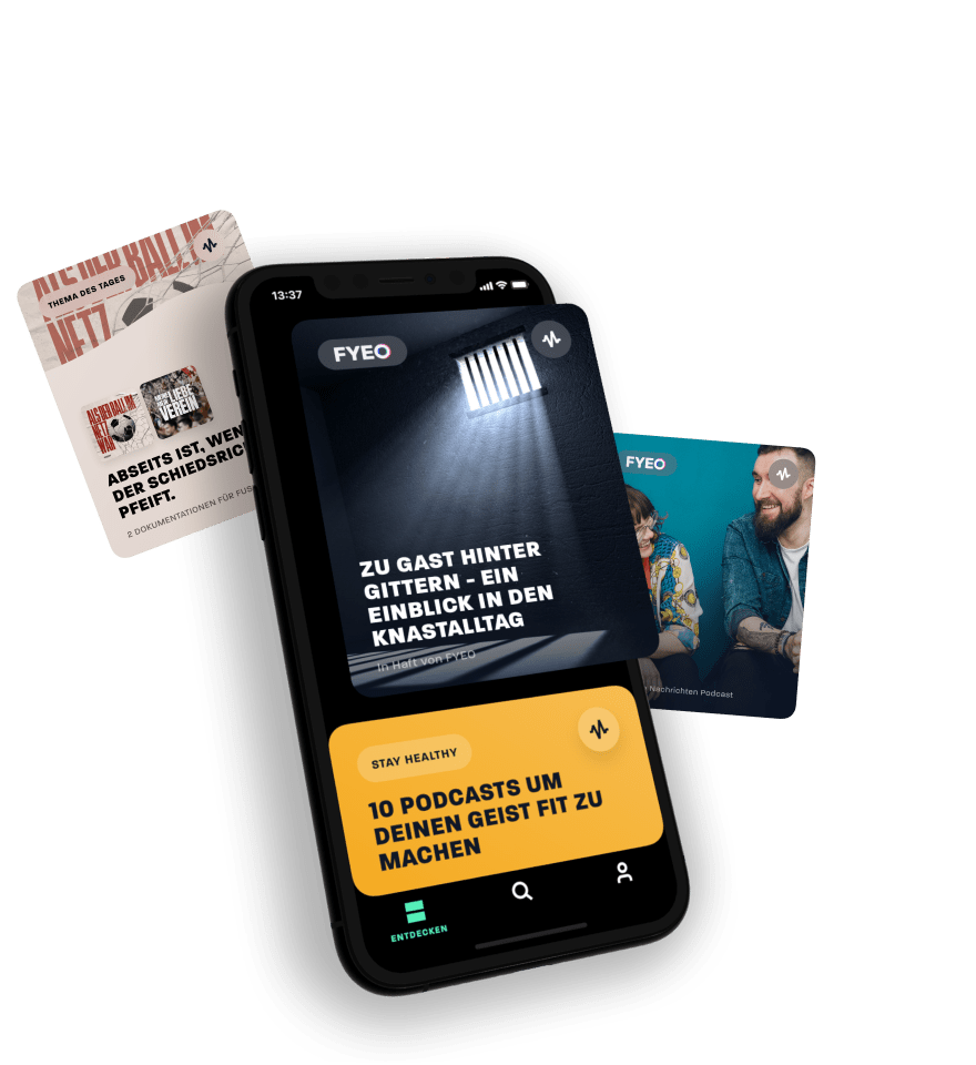
Watch how FYEO disrupts the world of audio content.


Our Challenges
High Market Pressure
The market for podcast apps is packed with strong competitors, giving new apps a hard time to make an impact.
A Unique User Experience
We believe that a truly unique user experience was one of the most crucial things to set FYEO apart from their competitors – so we really needed to reinvent the wheel.
A Home for Content Creators
FYEO wanted to become a new home to content creators, giving them the freedom and the credit they deserve.
Heterogenous Content
Podcast apps usally provide a stage to a large variety of very diverse content. Giving the interface an overall harmonic look? That’s a tough one.
A Stage for FYEO Originals
Our client is an expert in producing high-class content, so setting the perfect stage for their FYEO Originals was an absolute must-do.
The Paywall Barrier
People love premium content, but of course, asking them for compensation needs to be handled with care.
Applied Services
UX Research
UXi - User Experience Identity
UX/UI Design
App & Web Development

Product Strategy
First things first: Lending an ear to the user
In-Depth Research
An extensive in-depth research allowed us to dive deeply into the specific needs and preferences of FYEO’s target group. Among other results, we learned that many users would like to share interesting podcasts with their friends, create their own listener profile, and receive customised recommendations. Oh, and: interactive content should be a thing!

Usability Testing
Especially in the hyper-dense market of podcast apps, we wanted to make sure to offer a flawless experience. So, after having created the basic structure and the first designs of the FYEO app, we went into User Testing. Thrilled to see if real users would like our concept and design, we asked participants to fulfil several tasks with our prototype. Taking note of what they loved and what they struggled with helped us to further improve our UX/UI design.

UXi - User Experience Identity
FYEO is based on a unique brand character, which brings together high-quality standards and wild innovativeness. Building on this, we deduced the brand values Bold, Inspiring, Individual, and High-Quality. They will guide us the way in finding the perfectly matching UX/UI Design, which allows us to get the brand into the app.


Product Design
Let’s get brand-driven: Giving FYEO a voice!
UX Design
For the concept of the FYEO app, we made sure to provide an intuitively usable structure, giving the user easy access to their favorite features. Next to well-established patterns, we also involved some highly innovative elements, when we felt like they were a great solution for an upcoming challenge. Ever seen a vertical player in an audio app? Now’s the time.

UI Design
The visual design represents the unique constellation of FYEO’s brand values perfectly: We involved strong contrasts by combining edgy and round shapes, and a dark theme with bright highlight colors. The confident font and the playful icon set build the perfect stage for all the great audio adventures FYEO has up its sleeve for you. Another highlight: recurring circles and organic lines, representing the soundwaves that give the interface its distinctive look.


A visual design that's music to your ears.
We aimed for a design language that is both vibrant and subtle. Sounds impossible? We took up the challenge and made the content a priority. A smart algorithm identifies suitable color pairings from podcast covers, giving the app an overall harmonic look while respecting the individuality of each podcast.
Motion Design
A visual identity isn’t defined by visuals alone. Motion is key for bringing a brand to life. The motion design elements we chose for FYEO support both the overall user experience and the brand’s core values. We made sure the timings and easing-curves are just on point to ensure the perfect look & feel.

UX Writing
For FYEO, our goal was to fully drag users into the experience of audio storytelling. Hence, next to being helpful, clear and concise, the verbal communication of FYEO appears encouraging and energizing, determined to spark the users' curiosity for the next audio adventure. For that, the tonality makes references to the user experience via all senses, with, of course, a strong emphasis the hearing experience. Also, a special focus was put on carefully matching the choice of words with the choice of font in order to ensure readibility.


Product Development
The great finale: Turning our vision into code.
Collaboration is key: Tuning in to joint challenges
Our design had some tough challenges to it, among them the automated color picker for podcast covers and the vertical player. We supported our friends at RockAByte, who were responsible for the development of the FYEO app, in the proof of concept of these elements, and collaborated closely with them throughout the entire project.

Web Development
Now, one thing is for sure: FYEO deserves to be seen. This is why we created a website for them that is both visually appealing and informative. Here, users find further information about the most important features, FYEO Originals, and where to download the app.


