9 min read

Published
August 14, 2026
What Is a UX Audit? What We Look At and What You Get

Adrian
UX/UI Designer
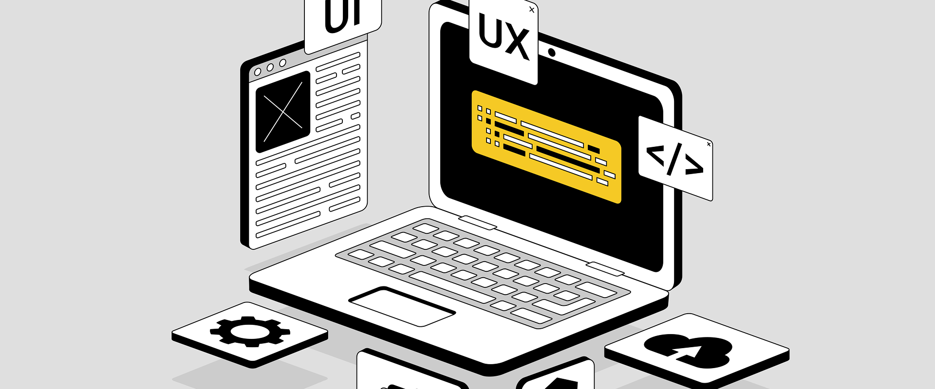
Picture the last time an app annoyed you. Nothing too dramatic, just a small irritation that ruined an otherwise nice experience.
Not long ago, we reviewed apps our UX designers regularly use, and one of them was DB Navigator. When booking a train with DB Navigator, you can also add a seat reservation to your ticket. Obviously, you’d think the best place to find the reservation is under your ticket, but surprise, the review found it’s actually inside a dropdown in the search mask, so adding a seat means starting a new booking from scratch.
Luckily, this issue has been resolved since then (maybe they read our review? 👀), but it’s one of those things that, when you stop to question it, you wonder how it possibly got released like that. And if you’re the owner of the app, you probably wish someone had flagged it before the app even came out, right? Your customers might put up with it, but if a better alternative to your app appears, they won’t waste any time leaving you.
A UX audit is designed to catch these kinds of issues before they start costing you time and money. Let’s see how.
.gif)
In the plainest terms, a UX audit is a structured review of how people experience your product, run by people who stare at this stuff for a living.
Think of it like a thorough health check, not a redesign. When we’re running an audit, we go through your product the way your users do, find what’s wrong or not quite working, and hand you a prioritised list of what's worth fixing, and in what order.
At COBE, we usually run audits across three angles: UX, accessibility, and code. For this article, we’ll stick to the UX side of things. If accessibility is the thing keeping you up at night, we've already written about how to audit a product for accessibility.
When we audit a product, we're checking whether the product actually works for the user. “What is the current user experience of your product or website like?” is the starting question of a UX audit. Or a bit more specifically, “How do users currently experience and interact with your digital product or service?”
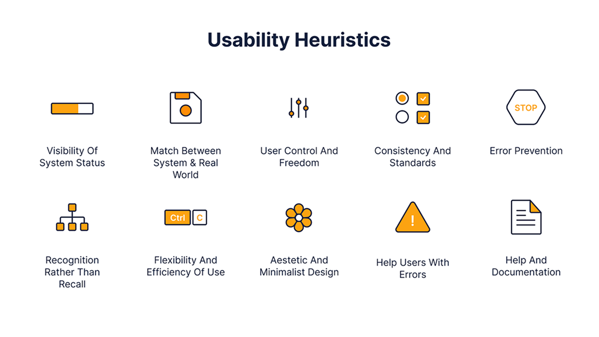
Practically, the goal is to identify areas for improvement that would make the user experience simpler, more intuitive, and more enjoyable. At COBE, we use established UX standards, especially Nielsen's 10 usability heuristics and the Laws of UX, to identify design weaknesses and derive concrete recommendations for action.
To make it less abstract, we’ll take the apps we previously reviewed and illustrate what a UX audit might look like with examples.
Findability is something you might not think about much until it doesn’t work. The DB Navigator seat reservation is the perfect example: the feature existed and worked, but it was in the last place anyone would think to look.
Perhaps this made sense to the team that made it, but they knew the ins and outs of the app and were used to it. It wouldn’t make sense to the actual users using the app for the first time.
The PAYBACK app is a digital loyalty and rewards program operating in Europe. It allows users to scan a digital card, activate coupons, and collect points across a variety of stores. (It’s what you use to collect dm points!)
Before the app’s recent inclusion of an integrated AI search that covers brands and products, you could only search for partner brands. So not for the products you were after, which is, well, the whole point. And it definitely felt quite restrictive.
Splitwise is a tool for a household to track bills and other shared expenses, so everyone gets paid back.
In our review, we found the same information showing up across several tabs. The app still works, but it might make people second-guess whether they're on the right screen. And you never want your users to feel confused.
That’s why we always strive for users to develop a mental model of the app. Think of it as a map of the app – users learn where which information lives over time, and can then easily recall it with every new use.
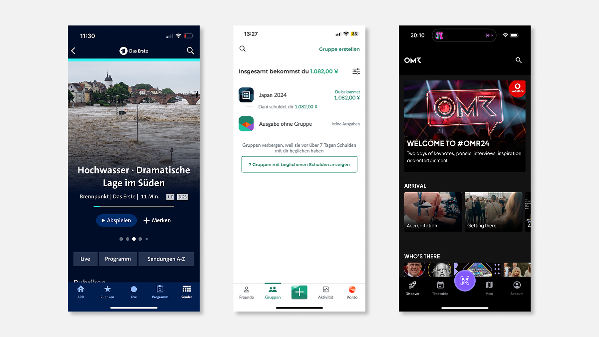
The OMR app has a venue map to help people get around. Lovely idea, except back when we looked into it, there was no signal inside the venue, so the map loaded into nothing at the exact moment you needed it.
You might argue it’s an edge case, but it’s clearly something no one considered in advance. If a feature isn’t properly tested in advance, you’re simply throwing money into the fire. (Luckily, this feature was addressed by the OMR app team as well, as the app now includes offline maps.)
The ARD Mediathek app allows you to watch the news, TV shows, documentaries, etc. The app works fine, but we flagged touch targets that were too small and links spaced too tightly together.
It’s something easy to overlook, but it can be quite irritating if your hands are full or your eyesight isn't perfect. This is also where UX and accessibility start to overlap.
This is a bit of a nebulous one. Loads of products function perfectly well, but feel generic, as if they could belong to anyone.
Oftentimes, design is a matter of preference, and this can result in a user experience that doesn’t match the brand. This is why we believe our UXi method is so important here, because it maps design decisions to your brand values, so every choice is based on what the brand needs rather than what someone likes.
The first step is to understand your product. We review your user analytics, data, and any relevant materials to understand what your product does, who it's for, and why its features matter. What do your users expect? What do they need? What problems are they trying to solve?
It’s just as important to know your business goals. If your big worry is people dropping off at checkout, we point the audit at that rather than grading everything equally. All this stops the audit from turning into a generic list of nitpicks.
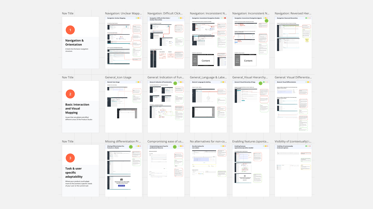
Then we get into the review itself. At COBE, our UX expert works through the core flows and use cases, mapping where people get stuck, while a UI colleague looks at consistency, visual hierarchy, spacing, and contrast. We know brand is inseparable from UX, so we also look at how the design aligns with your brand values.
Everything we find gets a severity rating to identify the most critical issues that break the experience and should be tackled as soon as possible. This also includes a rough estimate of how long it would take to resolve a problem, to see whether you might be able to achieve a few quick wins by tackling the ‘low-hanging fruit’ – issues that are easy to resolve.
A focused review like this usually takes two to three weeks, depending on the scope that is to be considered. Once it’s complete, we provide targeted UX recommendations: concrete improvements in UI design, navigation, and interaction flow.
If needed, we can also support you in the execution and equip your team with UX tools like Figma, usability testing platforms for continuous optimisation, and guidance on how you can keep improving post-audit.
If your product's been live for a while and you've got a nagging sense that something's off but can't quite put your finger on it, that's usually the moment an audit is the right step. Same goes if you're planning a relaunch and want to know what to fix before you rebuild, or if your numbers are sliding and nobody can say exactly why.
Tell us what's bugging you about your product, and we'll take a look. Worst case, your product's in better shape than you thought.
In a rush? Worry not, we’ve prepared a quick summary for you.
How long does a UX audit take? For a focused review, two to three weeks.
What do you actually get at the end? A prioritised list of what's worth fixing and in what order, each issue with a severity rating, plus concrete recommendations for UI, navigation and interaction flow.
Is a UX audit the same as a redesign? No. An audit is a health check, not a rebuild. An audit tells you what's wrong, how much each thing matters, and where to start.
When should you do a UX audit? When something feels off about your product, when you're planning a relaunch and want to know what to fix first, or when your numbers are sliding and you’re not sure why.
Adrian is an UX-Concepter working at COBE. The digital strategist’s focus areas include the user-centred development of digital products, accessibility and copywriting. When he is not putting up informational architectures for user interfaces he loves to learn more about people, how they communicate, interact and why they do what they do.